
mySewnet™ & PREMIER+™ 2 Software Newsletter - October 2021
Welcome to the mySewnet™ and PREMIER+™ 2 Embroidery Software Newsletter.
Check out our breaking information in News, then stick around for some inspiration!
Today's topic is Variations on a Theme with Color Tone  .
.
News
News
1.2 UPDATE RELEASED
mySewnet™ Embroidery Software version 1.2 is now available.
We encourage you to upgrade.
To upgrade to the latest version, run Check for Updates from mySewnet™ Configure.
This update includes:
- Portuguese language for the Windows version
- New feature in Embroidery - Name Changer
- Reorganized Embellish tab in Embroidery
- Several bug fixes
Feature
Feature
The Many Hues of Color Tone
Love the embroidery, not so certain of the color scheme? mySewnet™ Embroidery and PREMIER+™ 2 Embroidery embrace a clever function called Color Tone . With a few modifications, you can change up any embroidery.
Try out different tones to make your designs brighter or more muted, and then convert the threads automatically to your preferred thread brands!
Color Tone is found on the Home tab (Windows) or Design Panel (Mac) in mySewnet™ Embroidery and PREMIER+™ 2 Embroidery, and in mySewnet™ Stitch Editor and PREMIER+™ 2 Modify.
Simply Open or Insert an embroidery, a SuperDesign, or something you've digitized yourself in your mySewnet™ software, and then select Color Tone to adjust your colors in most common embroidery file types, and even system .edo files from Digitizing!
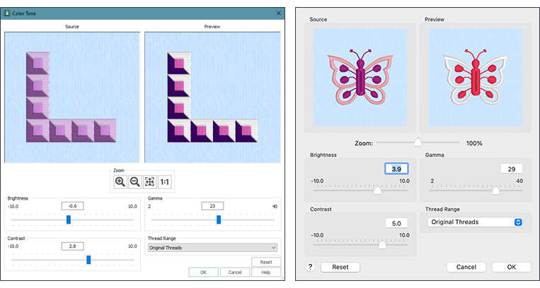
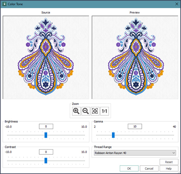
The Color Tone window has Zoom tools for examining areas closely (shown below in Windows and Mac).
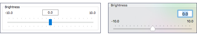
Adjust the vibrancy of color with the Brightness bar, dragging the slider to make the colors lighter or darker.
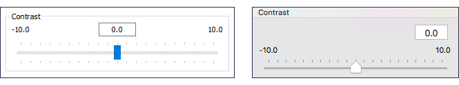
With Contrast, adjust areas to either stand out more or less within a design. Increase the Contrast to make dark areas darker, and light areas lighter. Decrease Contrast to lesson the contrast between areas.
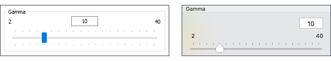
Gamma adjusts Brightness and Contrast at the same time. Gamma is useful for making designs either lighter or deeper in color without overexposing and whitening or graying the design.
If you have played and aren't satisfied with the current results, if you are still in the Color Tone window simply click Reset  to restore the original design settings.
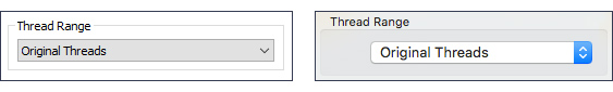
Did the embroidery designer choose a different thread brand than your collection? Click Original Threads in the Thread Range selector, and choose from hundreds of thousands of colors in many different thread manufacturers! Or select a personal My Thread collection to convert to nearest shades in the new Thread Range selection.
You can also return to the Original Threads if you choose.
Once you have selected OK  , you can still use Undo
  (Edit > Undo in Mac) to return to the original design, or a previous change.
Color Tone lends creative opportunity for mapping the entire thread list to a different thread range, all at one time. If you haven't yet tried out Color Tone, bring in a few embroidery designs or some Super Designs, and play with the Color Tone settings to see how many variations you can make.
Check out the Inspiration page for some ways to change up your colors with Color Tone.
INSPIRATION
INSPIRATION
Turn Grey Eyes to Blue!
Want a little inspiration for how Color Tone can change up today's life view?
Here are just a few ideas!
From bright and bold to pastel softness with the slide of a handle:
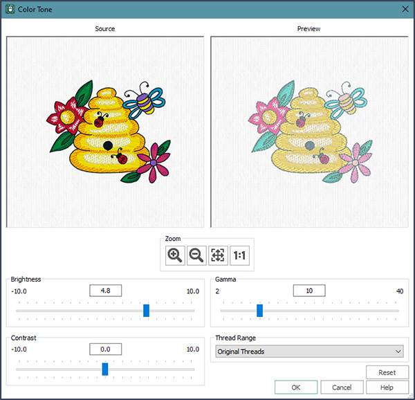
Shown below, Floral Beehive.vp4 from mySewnet|Samples|Stitch Editor|Stitch.
Original color on the left, and adjusted with Brightness to plus 4.8, creating a pastels look.
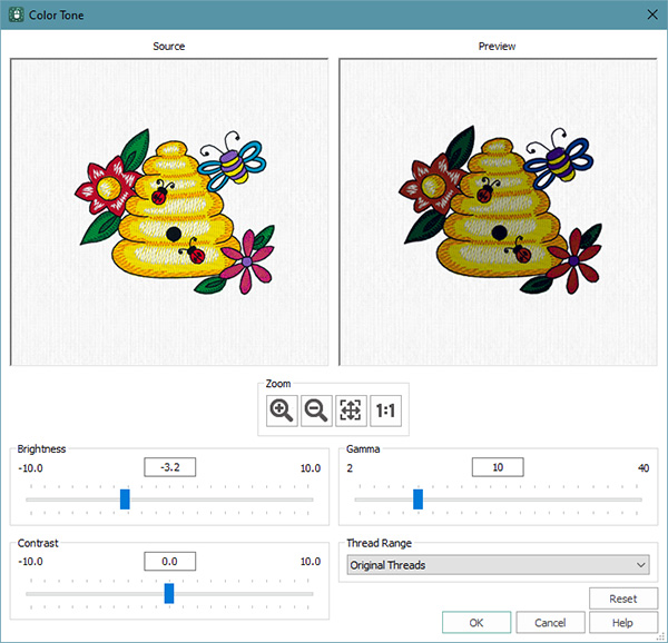
From bright and bold to subdued and shadowy:
Shown below, Brightness at minus 3.2, for deeper shaded color.
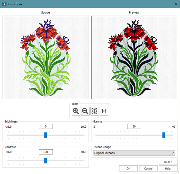
Middle-of-the-road goes to front and center:
Shown below, Three Flowers.vp4 from mySewnet|Samples|Embroidery|Stitch. Adjusted with Gamma to 36 for a stylized abstract appearance.
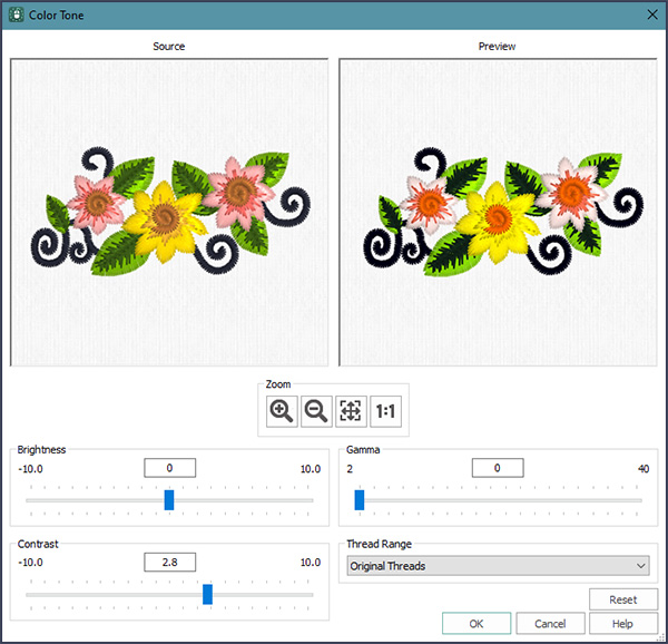
Subtle variations lend distinction:
Shown below, Floral Motif.vp4 from mySewnet|Samples|Stitch Editor|Stitch. Adjusted with Contrast at 2.8.
And of course, you can adjust any combination of Brightness, Gamma and Contrast to find your perfect settings!
My embroidery design doesn't use my personal thread collection!
Shown below, from the mySewnet™ Library, Paisley 200134004.evp3.
Adjusted from Sulky Rayon 40 to Robison Anton Rayon 40.
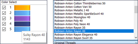
Color Tone gives you subtle variations on a theme, and then helps you cross-reference to the closest matching threads from the brands in your thread stash collection! Give it a spin today to adjust your embroideries for each project's special mood!
Did you know?
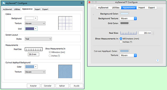
You can customize the mySewnet™ or PREMIER+™ 2 software windows' Appearance in Configure? Adjust default background color for the work area, add or remove a background texture, adjust Grid Color, calibrate the display with Real Size setting, and choose whether to use Millimeters or Inches as your default number system. Appliqué settings include the default Cut-out Appliqué Background color, and Texture.
Have a fabulous day, from the software team at mySewnet™ Embroidery!
PS:
Join us next month to view some of the exciting features and new functionality of mySewnet™ Draw & Paint!